Status: Canonical (v1.0)
Last updated: 2026-08-10
Taxonomy placement: D0. Color (Emotional Palette)
Audience: Design Systems, Product Design, Front-End Engineering
CEM uses color as the primary channel for communicating, using a branded palette to express:
Companion specs:
cem-dimension.md) — spacing scale, density modes, and layout gapscem-coupling.md) — density affects perceived color intensity and separabilitycem-shape.md) — rounded shapes soften color impactcem-layering.md) — tonal shifts for depth perception (recess/lift)cem-stroke.md) — focus/selection colors; D0 defines hue, D5 defines geometrycem-voice-fonts-typography.md) — text contrast requirementscem-timing.md) — color transition timingD0 (Color) defines:
D0 (Color) does not define:
This spec defines consumer-semantic color tokens for CEM:
--cem-color-*) used as implementation substrate.--cem-palette-*) that expresses meaning in user language (comfort, trust, danger, etc.).--cem-action-*) for buttons/steps and other “do something” controls.--cem-navigation-item-*) for links, disclosures, and tabs that move or switch
context while preserving current/selected meaning.--cem-content-interaction-*) for content-owned native controls such as
checkable chips and selectable-list composites, without classifying them as actions, navigation, or form inputs.--cem-separator-color) for non-content lines that reinforce sibling separation
without acquiring the full salience of readable text.--cem-zebra-*) used with D5 Stroke to express selection/focus/target without relying on
fill.Non-goals:
Tokens are named for what the user experiences (comfort, danger, trust) and for flow semantics (primary, destructive, selected, pending), rather than for RGB/hex values.
CEM intentionally separates meaning across channels:
--cem-zebra-*) for high-salience but non-fill states (focus/target/selected).This avoids overloading color fill and improves accessibility in compact/dense UIs.
To avoid “palette explosion”, D0 constrains variation intentionally:
xl, l, d, xd), not per-component
shades.color-mix() rather than hand-picked colors.When forced-colors is active, system colors win. CEM must preserve semantics using Canvas, CanvasText,
Highlight, SelectedItem, etc., and avoid losing meaning when shadows/glows are dropped by the UA.
Emotional terms (what the interface wants the user to feel):
| Term | Primary palette token | Typical usage |
|---|---|---|
| comfort | --cem-palette-comfort | canvas/surfaces, low-salience backgrounds |
| calm | --cem-palette-calm | subtle affordances, secondary emphasis |
| trust | --cem-palette-trust | explicit emphasis, strong call-to-action |
| enthusiasm | --cem-palette-enthusiasm | alternate emphasis, “positive energy” |
| creativity | --cem-palette-creativity | primary emphasis, “go forward” actions |
| danger | --cem-palette-danger | errors, destructive affordances |
| conservative | --cem-palette-conservative | neutral/disabled, “quiet UI” |
Action terms (what an action will do):
| Term | Intent token prefix | Typical usage |
|---|---|---|
| primary | --cem-action-primary-* | default “go forward” action |
| explicit | --cem-action-explicit-* | strong call-to-action |
| contextual | --cem-action-contextual-* | within-context action |
| alternate | --cem-action-alternate-* | secondary/alternate action |
| destructive | --cem-action-destructive-* | deletion, irreversible change |
State terms (how condition changes):
| State | Channel | Notes |
|---|---|---|
| disabled/readonly/editable | background + text | subdued progression (see §7.2) |
| hover/active/pending | background + text | formulaic color-mix() progression (see §7.2) |
| focus/selected/target | outline (zebra) | do not rely on fill alone (see §8) |
Branded hues (implementation substrate)
  --cem-color-{hue}-{variant}
        │
        ▼
Emotional palette (semantic contract)
  --cem-palette-{emotion} (+ -x / -text / -text-x)
        │
        ▼
Action intents (consumer-facing API)
  --cem-action-{intent}-{state}-{attribute}
CEM color endpoints are layered:
--cem-color-{hue}-{variant}--cem-palette-{emotion} and --cem-palette-{emotion}-text--cem-action-{intent}-{state}-{attribute}--cem-zebra-color-0..3 + strip sizeRule: consumers should theme primarily by adjusting palette and (optionally) base colors; product code should depend on palette/action/zebra endpoints.
Branded hues are provided in a small, repeatable set of brightness variants:
| Variant | Meaning (relative) | Typical role |
|---|---|---|
xl | lightest | large surface fills in light schemes; extreme contrast partner in dark |
l | light | standard surface/intent fill in light schemes |
d | dark | standard surface/intent fill in dark schemes |
xd | darkest | extreme contrast partner in light schemes; deep surfaces in dark |
When selecting a safe pairing (especially for text and outlines), prefer opposite ends:
xl/l): pair with d or xd for text/outline.d/xd): pair with l or xl for text/outline.The neutral/grey family is intentionally smaller (typically l + d) and is used primarily via the conservative
palette.
The base family is a small set of named hues with a few variants. These are reference values (from
theme-data.xhtml) and may be overridden by a brand, as long as the semantic palette mappings remain coherent.
| Token | Hue | Variant | Value | Label | Intended use | Tier |
|---|---|---|---|---|---|---|
--cem-color-blue-xl | blue | xl | #e0e8ff | Lightest blue | Trust palette (light scene surface) | recommended |
--cem-color-blue-l | blue | l | #d7e3ff | Light blue | Trust palette, attention semantic | recommended |
--cem-color-blue-d | blue | d | #002f65 | Dark blue | Trust palette (dark theme) | recommended |
--cem-color-blue-xd | blue | xd | #001b3f | Darkest blue | Trust palette (dark scene surface) | recommended |
--cem-color-brown-xl | brown | xl | #d7ccc8 | Extra light brown | Conservative palette (light theme) | recommended |
--cem-color-brown-l | brown | l | #a1887f | Light brown | Conservative emotion, brand-3 | recommended |
--cem-color-brown-d | brown | d | #4e342e | Dark brown | Conservative palette (dark theme) | recommended |
--cem-color-brown-xd | brown | xd | #3e2723 | Extra dark brown | Conservative palette (dark theme, extreme) | recommended |
--cem-color-cyan-xl | cyan | xl | #f1fefe | Extra light cyan | Used for comfort palette (light scenes) | recommended |
--cem-color-cyan-l | cyan | l | #00fbfb | Light cyan | Calm palette, creativity accent | recommended |
--cem-color-cyan-d | cyan | d | #006a6a | Dark cyan | Calm palette (dark theme) | recommended |
--cem-color-cyan-xd | cyan | xd | #001010 | Extra dark cyan | Used for comfort palette (dark scenes) | recommended |
--cem-color-grey-l | grey | l | #f1f1eb | Light grey | Conservative palette, neutral backgrounds | recommended |
--cem-color-grey-d | grey | d | #1a1c18 | Dark grey | Conservative palette (dark theme) | recommended |
--cem-color-orange-xl | orange | xl | #f0f070 | Extra light yellow | Enthusiasm palette (light theme) | recommended |
--cem-color-orange-l | orange | l | #ffe082 | Light orange | Enthusiasm emotion, brand-2 | recommended |
--cem-color-orange-d | orange | d | #723600 | Dark orange | Enthusiasm hype (dark theme) | recommended |
--cem-color-orange-xd | orange | xd | #502400 | Extra dark orange | Enthusiasm palette (dark theme, extreme) | recommended |
--cem-color-purple-xl | purple | xl | #f3e5f5 | Extra light purple | Creativity palette (light theme) | recommended |
--cem-color-purple-l | purple | l | #e1bee7 | Light purple | Creativity emotion, brand-1 | recommended |
--cem-color-purple-d | purple | d | #6a1b9a | Dark purple | Creativity palette (dark theme) | recommended |
--cem-color-purple-xd | purple | xd | #4a148c | Extra dark purple | Creativity palette (dark theme, extreme) | recommended |
--cem-color-red-xl | red | xl | #ffb4ab | Extra light red | Danger palette (light theme) | recommended |
--cem-color-red-l | red | l | #ba1a1a | Light red | Danger emotion, alert semantic | recommended |
--cem-color-red-d | red | d | #690005 | Dark red | Danger palette (dark theme) | recommended |
--cem-color-red-xd | red | xd | #410002 | Extra dark red | Danger palette (dark theme, extreme) | recommended |
--cem-color-visitedtext-30-black | nat | d | color-mix(in srgb, VisitedText 30%, black) | light trust-x | Native palette Trust extreme variant | recommended |
--cem-color-visitedtext-30-white | nat | l | color-mix(in srgb, VisitedText 30%, white) | dark trust-x | Native palette Trust extreme variant | recommended |
--cem-color-mark-30-black | nat | d | color-mix(in srgb, Mark 30%, black) | light enthusiasm-x | Native palette Enthusiasm extreme variant | recommended |
--cem-color-mark-30-white | nat | l | color-mix(in srgb, Mark 30%, white) | dark enthusiasm-x | Native palette Enthusiasm extreme variant | recommended |
--cem-color-canvastext-30-purple | nat | d | color-mix(in srgb, CanvasText 30%, purple ) | light creativity-x | Native palette Creativity extreme variant | recommended |
--cem-color-canvastext-30-lightpink | nat | l | color-mix(in srgb, CanvasText 30%, lightpink) | dark creativity-x | Native palette Creativity extreme variant | recommended |
--cem-color-red-30-black | nat | d | color-mix(in srgb, red 30%, black) | light danger-x | Native palette Danger extreme variant | recommended |
--cem-color-red-30-white | nat | l | color-mix(in srgb, red 30%, white) | dark danger-x | Native palette Danger extreme variant | recommended |
--cem-color-white | nat | l | white | dark trust text | Trust and Extreme palette dark mode text | recommended |
Variant semantics:
xl / l: light-scene support (surfaces, containers, accents)d / xd: dark-scene support (surfaces, ink-safe accents)CSS system colors adapt automatically to the user's
OS color scheme. In native mode, CEM maps palette endpoints directly to these values (see §9).
| Color | Text pair | Description |
|---|---|---|
AccentColor | AccentColorText | Background of accented user interface controls |
AccentColorText | AccentColor | Text of accented user interface controls |
ActiveText | Canvas | Text of active links |
ButtonBorder | Canvas | Base border color of controls |
ButtonFace | CanvasText | Background color of controls |
ButtonText | Canvas | Text color of controls |
Canvas | CanvasText | Background of application content or documents |
CanvasText | Canvas | Text color in application content or documents |
Field | CanvasText | Background of input fields |
FieldText | Canvas | Text in input fields |
GrayText | Canvas | Text color for disabled items |
Highlight | HighlightText | Background of selected items |
HighlightText | Highlight | Text color of selected items |
LinkText | Canvas | Text of non-active, non-visited links |
Mark | MarkText | Background of specially marked text (e.g. <mark>) |
MarkText | Mark | Text of specially marked text |
SelectedItem | SelectedItemText | Background of selected items (e.g. checkbox) |
SelectedItemText | SelectedItem | Text of selected items |
VisitedText | Canvas | Text of visited links |
The emotional palette is the primary semantic contract for color.
Reference mappings (from theme-data.xhtml) use light-dark() so a single token resolves appropriately for light vs dark schemes.
| Token | Role | Light | dark | Native Light | Native Dark | Usage | Emotion | Shift | tier |
|---|---|---|---|---|---|---|---|---|---|
--cem-palette-comfort | Base comfort color | cyan-xl | cyan-xd | Canvas | Main canvas/background | comfort | required | ||
--cem-palette-comfort-x | Comfort extreme variant | cyan-xd | cyan-xl | CanvasText | Used in color-mix for state variations | comfort | x | recommended | |
--cem-palette-comfort-text | Comfort text color | cyan-xd | cyan-xl | CanvasText | Primary text on comfort backgrounds | comfort | text | required | |
--cem-palette-comfort-text-x | Comfort extreme text | cyan-xl | cyan-xd | Canvas | Text on extreme variant backgrounds | comfort | text-x | recommended | |
--cem-palette-calm | Base calm color | cyan-l | cyan-d | cyan | Foreground elements | calm | recommended | ||
--cem-palette-calm-x | Calm extreme variant | cyan-d | cyan-l | rgb(0, 120, 120) | Inverted calm color ( darked darkcyan ) | calm | x | recommended | |
--cem-palette-calm-text | Calm text color | comfort-text | comfort-text | black | Text on calm backgrounds | calm | text | recommended | |
--cem-palette-calm-text-x | Calm extreme text | comfort-text-x | comfort-text-x | white | Text on extreme calm backgrounds | calm | text-x | recommended | |
--cem-palette-trust | Base trust color | blue-l | blue-d | color-mix(in srgb, Highlight 70%, black) | Explicit actions, highlights | trust | required | ||
--cem-palette-trust-x | Trust extreme variant | blue-d | blue-l | --cem-color-visitedtext-30-black | --cem-color-visitedtext-30-white | Darker/lighter trust variation | trust | x | recommended |
--cem-palette-trust-text | Trust text color | comfort-text | white | HighlightText | Text on trust backgrounds | trust | text | required | |
--cem-palette-trust-text-x | Trust extreme text | comfort-text-x | comfort-text-x | Canvas | Canvas | Text on extreme trust backgrounds | trust | text-x | recommended |
--cem-palette-enthusiasm | Base enthusiasm color | orange-l | orange-d | Mark | Brand-2, alternate actions | enthusiasm | recommended | ||
--cem-palette-enthusiasm-x | Enthusiasm extreme variant | orange-xd | orange-xl | --cem-color-mark-30-black | --cem-color-mark-30-white | Darker/lighter enthusiasm variation | enthusiasm | x | recommended |
--cem-palette-enthusiasm-text | Enthusiasm text color | comfort-text | white | MarkText | Text on enthusiasm backgrounds | enthusiasm | text | recommended | |
--cem-palette-enthusiasm-text-x | Enthusiasm extreme text | comfort-text-x | comfort-text-x | Canvas | Text on extreme enthusiasm backgrounds | enthusiasm | text-x | recommended | |
--cem-palette-creativity | Base creativity color | purple-l | purple-d | ButtonFace | Brand-1, primary actions | creativity | recommended | ||
--cem-palette-creativity-x | Creativity extreme variant | purple-d | purple-l | --cem-color-canvastext-30-purple | --cem-color-canvastext-30-lightpink | Darker/lighter creativity variation | creativity | x | recommended |
--cem-palette-creativity-text | Creativity text color | comfort-text | comfort-text | CanvasText | Text on creativity backgrounds | creativity | text | recommended | |
--cem-palette-creativity-text-x | Creativity extreme text | comfort-text-x | comfort-text-x | Canvas | Text on extreme creativity backgrounds | creativity | text-x | recommended | |
--cem-palette-danger | Base danger color | red-l | red-d | --cem-color-red-l | --cem-color-red-d | Error messages, destructive actions | danger | required | |
--cem-palette-danger-x | Danger extreme variant | red-d | red-l | --cem-color-red-30-black | --cem-color-red-30-white | Darker/lighter danger variation | danger | x | recommended |
--cem-palette-danger-text | Danger text color | comfort-text-x | comfort-text | Canvas | CanvasText | Text on danger backgrounds | danger | text | required |
--cem-palette-danger-text-x | Danger extreme text | orange-xl | orange-xl | Canvas | High contrast text on extreme danger backgrounds | danger | text-x | recommended | |
--cem-palette-conservative | Base conservative color | grey-l | grey-d | ButtonFace | Brand-3, disabled states | conservative | required | ||
--cem-palette-conservative-x | Conservative extreme variant | grey-d | grey-l | CanvasText | Darker/lighter conservative variation | conservative | x | recommended | |
--cem-palette-conservative-text | Conservative text color | comfort-text | comfort-text | CanvasText | Text on conservative backgrounds | conservative | text | required | |
--cem-palette-conservative-text-x | Conservative extreme text | comfort-text-x | comfort-text-x | Canvas | Text on extreme conservative backgrounds | conservative | text-x | recommended |
CEM defines 5 operational modes for color behavior:
| Mode | Color scheme | Description |
|---|---|---|
native | system | Rely on system colors (Canvas, CanvasText, etc.) |
light | light | Branded palette in light scheme |
dark | dark | Branded palette in dark scheme |
contrast-light | light | Minimize fill differences; emphasize outlines/markers |
contrast-dark | dark | Same, in dark scheme |
Normative expectations:
native MUST preserve meaning using system semantic colors (no hard-coded hex assumptions).contrast-* MUST NOT encode state primarily via background darkness; state must remain legible via zebra outline and
markers.Action tokens encode user-flow intent (primary, explicit, destructive, etc.) and interaction/state.
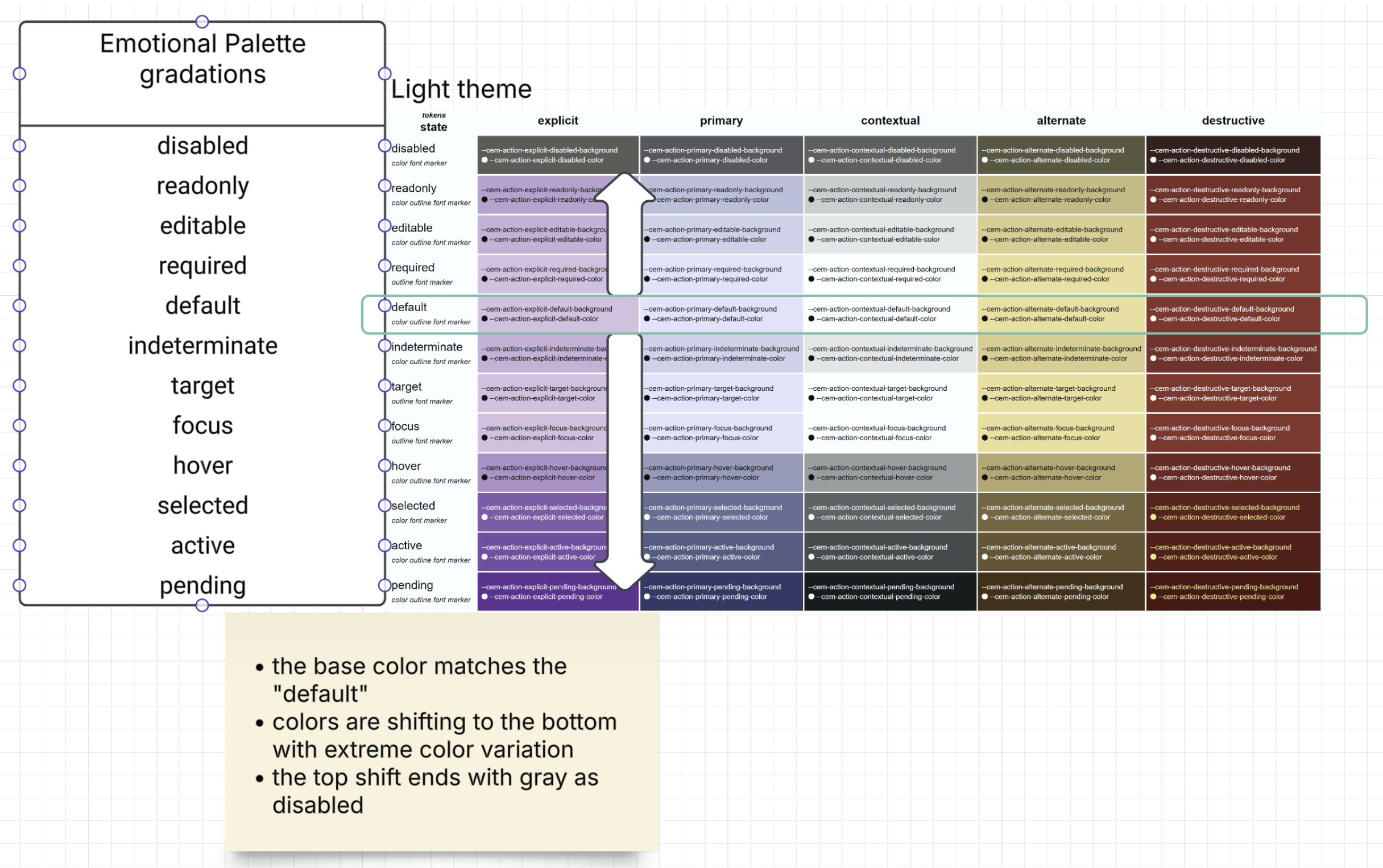
Supplemental title: Light theme — Emotional palette gradations across interaction states (action intents).
Notes (interpretation):
default state row.*-x) for higher salience.disabled, preserving “less available” semantics.| Action intent | Emotional palette | Branded (light) | Branded (dark) | Primary token |
|---|---|---|---|---|
explicit | trust | blue-l (#d7e3ff) | blue-d (#002f65) | --cem-action-explicit-default-background |
primary | creativity | purple-l (#e1bee7) | purple-d (#6a1b9a) | --cem-action-primary-default-background |
contextual | comfort | cyan-xl (#f1fefe) | cyan-xd (#001010) | --cem-action-contextual-default-background |
alternate | enthusiasm | orange-l (#ffe082) | orange-d (#723600) | --cem-action-alternate-default-background |
destructive | danger | red-l (#ba1a1a) | red-d (#690005) | --cem-action-destructive-default-background |
CEM action states (union of form/action semantics and interaction semantics):
disabledreadonlyeditablerequireddefaultindeterminatetargetfocushoverselectedactivependingState progression is defined as a formulaic movement from “least emphasized” to “most emphasized”, using
color-mix() against the emotion’s extreme variant (--cem-palette-{emotion}-x).
disabled → readonly → editable → default → indeterminate → hover → active → pending
 (30%)      (80%)      (90%)      (base)   (90%)          (70%)   (25%)   (5%)
--cem-palette-conservative-x) to desaturate and quiet the
UI.| State | Background formula (palette-level) | Text token | Contrast background | Contrast text | tier |
|---|---|---|---|---|---|
| disabled | color-mix(in srgb, var(--cem-palette-[emotion]) 30%, var(--cem-palette-conservative-x)) | var(--cem-palette-conservative-text-x) | var(--cem-palette-comfort) | color-mix(in srgb, var(--cem-palette-comfort-text) 38%, var(--cem-palette-comfort)) | required |
| readonly | color-mix(in srgb, var(--cem-palette-[emotion]) 80%, var(--cem-palette-[emotion]-x)) | var(--cem-palette-[emotion]-text) | var(--cem-palette-comfort) | var(--cem-palette-comfort-text) | recommended |
| editable | color-mix(in srgb, var(--cem-palette-[emotion]) 90%, var(--cem-palette-[emotion]-x)) | var(--cem-palette-[emotion]-text) | var(--cem-palette-comfort) | var(--cem-palette-comfort-text) | recommended |
| default | var(--cem-palette-[emotion]) | var(--cem-palette-[emotion]-text) | var(--cem-palette-comfort) | var(--cem-palette-comfort-text) | required |
| indeterminate | color-mix(in srgb, var(--cem-palette-[emotion]) 90%, var(--cem-palette-[emotion]-x)) | var(--cem-palette-[emotion]-text) | var(--cem-palette-comfort) | var(--cem-palette-comfort-text) | recommended |
| hover | color-mix(in srgb, var(--cem-palette-[emotion]) 70%, var(--cem-palette-[emotion]-x)) | var(--cem-palette-[emotion]-text) | var(--cem-palette-comfort) | var(--cem-palette-comfort-text) | required |
| active | color-mix(in srgb, var(--cem-palette-[emotion]) 25%, var(--cem-palette-[emotion]-x)) | var(--cem-palette-[emotion]-text-x) | var(--cem-palette-comfort) | var(--cem-palette-comfort-text) | required |
| pending | color-mix(in srgb, var(--cem-palette-[emotion]) 5%, var(--cem-palette-[emotion]-x)) | var(--cem-palette-[emotion]-text-x) | var(--cem-palette-comfort) | var(--cem-palette-comfort-text) | recommended |
Applying this to action intents: substitute [emotion] with the emotional palette mapped by the intent (see §7.1).
The resulting values populate --cem-action-{intent}-{state}-background and --cem-action-{intent}-{state}-text.
Outside contrast modes, pending actions MUST show a repeating 45-degree background gradient while their busy source is true. A one-shot color fade is not the pending-motion contract. Use the intent's pending background and dedicated pending stripe background as its two gradient colors, with pending text throughout. Primary, explicit, contextual and alternate use one shared adjustment: mix the active endpoint with 12% white in light schemes and 20% black in dark schemes. Destructive keeps 25% white / 50% black because its yellow foreground has a different contrast range. The default endpoints must exceed 1.8:1 stripe separation and preserve at least 4.5:1 text contrast across the gradient. Dark contrast contours share these endpoints. Light contrast contours use a brighter stripe (40% white, or extra-light red for destructive) as specified in §7.5. Active button paint is unchanged; the pending background remains a color, including as the solid fallback.
| Token | Value | Description | tier |
|---|---|---|---|
--cem-pending-color-1 | var(--cem-action-primary-pending-background) | First gradient color; bind to the current intent's pending background | recommended |
--cem-pending-color-2 | var(--cem-action-primary-pending-stripe-background) | Second gradient color; bind to the current intent's pending stripe background | recommended |
--cem-action-primary-pending-stripe-background | light-dark(color-mix(in srgb, var(--cem-action-primary-active-background) 88%, var(--cem-color-white)), color-mix(in srgb, var(--cem-action-primary-active-background) 80%, black)) | Pending stripe: 12% white in light schemes; 20% black in dark schemes | recommended |
--cem-action-explicit-pending-stripe-background | light-dark(color-mix(in srgb, var(--cem-action-explicit-active-background) 88%, var(--cem-color-white)), color-mix(in srgb, var(--cem-action-explicit-active-background) 80%, black)) | Pending stripe: 12% white in light schemes; 20% black in dark schemes | recommended |
--cem-action-contextual-pending-stripe-background | light-dark(color-mix(in srgb, var(--cem-action-contextual-active-background) 88%, var(--cem-color-white)), color-mix(in srgb, var(--cem-action-contextual-active-background) 80%, black)) | Pending stripe: 12% white in light schemes; 20% black in dark schemes | recommended |
--cem-action-alternate-pending-stripe-background | light-dark(color-mix(in srgb, var(--cem-action-alternate-active-background) 88%, var(--cem-color-white)), color-mix(in srgb, var(--cem-action-alternate-active-background) 80%, black)) | Pending stripe: 12% white in light schemes; 20% black in dark schemes | recommended |
--cem-action-destructive-pending-stripe-background | light-dark(color-mix(in srgb, var(--cem-action-destructive-active-background) 75%, var(--cem-color-white)), color-mix(in srgb, var(--cem-action-destructive-active-background) 50%, black)) | Destructive pending stripe: lighten the active endpoint with 25% white in light schemes; darken it with 50% black in dark schemes | recommended |
--cem-action-primary-pending-image | linear-gradient(var(--cem-pending-angle), color-mix(in srgb, var(--cem-palette-creativity) 5%, var(--cem-palette-creativity-x)) 0% 5%, light-dark(color-mix(in srgb, color-mix(in srgb, var(--cem-palette-creativity) 25%, var(--cem-palette-creativity-x)) 60%, var(--cem-color-white)), color-mix(in srgb, color-mix(in srgb, var(--cem-palette-creativity) 25%, var(--cem-palette-creativity-x)) 80%, black)) 20% 30%, color-mix(in srgb, var(--cem-palette-creativity) 5%, var(--cem-palette-creativity-x)) 45% 55%, light-dark(color-mix(in srgb, color-mix(in srgb, var(--cem-palette-creativity) 25%, var(--cem-palette-creativity-x)) 60%, var(--cem-color-white)), color-mix(in srgb, color-mix(in srgb, var(--cem-palette-creativity) 25%, var(--cem-palette-creativity-x)) 80%, black)) 70% 80%, color-mix(in srgb, var(--cem-palette-creativity) 5%, var(--cem-palette-creativity-x)) 95% 100%) | Primary pending recipe; 40% white stripe in light contrast; ordinary dark endpoint | recommended |
--cem-action-explicit-pending-image | linear-gradient(var(--cem-pending-angle), color-mix(in srgb, var(--cem-palette-trust) 5%, var(--cem-palette-trust-x)) 0% 5%, light-dark(color-mix(in srgb, color-mix(in srgb, var(--cem-palette-trust) 25%, var(--cem-palette-trust-x)) 60%, var(--cem-color-white)), color-mix(in srgb, color-mix(in srgb, var(--cem-palette-trust) 25%, var(--cem-palette-trust-x)) 80%, black)) 20% 30%, color-mix(in srgb, var(--cem-palette-trust) 5%, var(--cem-palette-trust-x)) 45% 55%, light-dark(color-mix(in srgb, color-mix(in srgb, var(--cem-palette-trust) 25%, var(--cem-palette-trust-x)) 60%, var(--cem-color-white)), color-mix(in srgb, color-mix(in srgb, var(--cem-palette-trust) 25%, var(--cem-palette-trust-x)) 80%, black)) 70% 80%, color-mix(in srgb, var(--cem-palette-trust) 5%, var(--cem-palette-trust-x)) 95% 100%) | Explicit pending recipe; 40% white stripe in light contrast; ordinary dark endpoint | recommended |
--cem-action-contextual-pending-image | linear-gradient(var(--cem-pending-angle), color-mix(in srgb, var(--cem-palette-comfort) 5%, var(--cem-palette-comfort-x)) 0% 5%, light-dark(color-mix(in srgb, color-mix(in srgb, var(--cem-palette-comfort) 25%, var(--cem-palette-comfort-x)) 60%, var(--cem-color-white)), color-mix(in srgb, color-mix(in srgb, var(--cem-palette-comfort) 25%, var(--cem-palette-comfort-x)) 80%, black)) 20% 30%, color-mix(in srgb, var(--cem-palette-comfort) 5%, var(--cem-palette-comfort-x)) 45% 55%, light-dark(color-mix(in srgb, color-mix(in srgb, var(--cem-palette-comfort) 25%, var(--cem-palette-comfort-x)) 60%, var(--cem-color-white)), color-mix(in srgb, color-mix(in srgb, var(--cem-palette-comfort) 25%, var(--cem-palette-comfort-x)) 80%, black)) 70% 80%, color-mix(in srgb, var(--cem-palette-comfort) 5%, var(--cem-palette-comfort-x)) 95% 100%) | Contextual pending recipe; 40% white stripe in light contrast; ordinary dark endpoint | recommended |
--cem-action-alternate-pending-image | linear-gradient(var(--cem-pending-angle), color-mix(in srgb, var(--cem-palette-enthusiasm) 5%, var(--cem-palette-enthusiasm-x)) 0% 5%, light-dark(color-mix(in srgb, color-mix(in srgb, var(--cem-palette-enthusiasm) 25%, var(--cem-palette-enthusiasm-x)) 60%, var(--cem-color-white)), color-mix(in srgb, color-mix(in srgb, var(--cem-palette-enthusiasm) 25%, var(--cem-palette-enthusiasm-x)) 80%, black)) 20% 30%, color-mix(in srgb, var(--cem-palette-enthusiasm) 5%, var(--cem-palette-enthusiasm-x)) 45% 55%, light-dark(color-mix(in srgb, color-mix(in srgb, var(--cem-palette-enthusiasm) 25%, var(--cem-palette-enthusiasm-x)) 60%, var(--cem-color-white)), color-mix(in srgb, color-mix(in srgb, var(--cem-palette-enthusiasm) 25%, var(--cem-palette-enthusiasm-x)) 80%, black)) 70% 80%, color-mix(in srgb, var(--cem-palette-enthusiasm) 5%, var(--cem-palette-enthusiasm-x)) 95% 100%) | Alternate pending recipe; 40% white stripe in light contrast; ordinary dark endpoint | recommended |
--cem-action-destructive-pending-image | linear-gradient(var(--cem-pending-angle), color-mix(in srgb, var(--cem-palette-danger) 5%, var(--cem-palette-danger-x)) 0% 5%, light-dark(var(--cem-color-red-xl), color-mix(in srgb, color-mix(in srgb, var(--cem-palette-danger) 25%, var(--cem-palette-danger-x)) 50%, black)) 20% 30%, color-mix(in srgb, var(--cem-palette-danger) 5%, var(--cem-palette-danger-x)) 45% 55%, light-dark(var(--cem-color-red-xl), color-mix(in srgb, color-mix(in srgb, var(--cem-palette-danger) 25%, var(--cem-palette-danger-x)) 50%, black)) 70% 80%, color-mix(in srgb, var(--cem-palette-danger) 5%, var(--cem-palette-danger-x)) 95% 100%) | Destructive pending recipe; Extra-light red stripe in light contrast; ordinary dark endpoint | recommended |
The intent image recipes use the pending (5%) and active (25%) palette formulas
directly so contrast fill overrides cannot erase their colors. Dark contours match normal fill endpoints. Light contours mix the active
palette endpoint with 40% white; destructive uses --cem-color-red-xl.
The ordinary fill keeps its text-safe stripe.
Existing per-control fill color overrides remain independent.
Native themes retain their system-palette active stripe endpoints for the four ordinary intents; mixing them with fixed white/black can reduce text contrast. Destructive retains its existing native recipe.
| Token | Value |
|---|---|
--cem-action-primary-pending-stripe-background | var(--cem-action-primary-active-background) |
--cem-action-explicit-pending-stripe-background | var(--cem-action-explicit-active-background) |
--cem-action-contextual-pending-stripe-background | var(--cem-action-contextual-active-background) |
--cem-action-alternate-pending-stripe-background | var(--cem-action-alternate-active-background) |
D5 owns --cem-pending-angle (45deg) and --cem-pending-tile-size (2rem).
D7 owns --cem-duration-pending-cycle (2000ms). Use uniform easing and infinite
iteration. Translate the background by one square tile along the x axis per
cycle. Each transition holds its initial color for 20%, blends for 60%, then
holds the final color for 20%. The alternating color ranges are 0–5%, 20–30%,
45–55%, 70–80% and 95–100%; the gaps blend continuously. At 45 degrees, opposite tile edges
match and translating one tile closes the loop without a jump. Freeze the
pattern under reduced motion. Under forced colors, suppress the gradient and
motion and use system button colors with a persistent pending-width boundary.
Keep zebra focus rings independent of background motion.
The generated .cem-pending theme utility demonstrates this recipe. Consumers
bind the two color inputs and pending foreground for their intent. Canonical
components own the same recipe in their embedded scoped CSS. cem-action
activates it for pending="true", including disabled buttons. Pending paint
takes precedence over disabled paint while pending; native disabled semantics
still block activation and focus. Clearing pending while disabled restores the
disabled colors.
Pending does not itself disable activation. Hover and focus do not restart or
replace the continuous animation. Clearing pending removes the gradient and
motion and restores current interaction paint.
focus, selected, and target are primarily expressed through the zebra outline channel (§8). Background tokens
MAY remain at default for these states; do not rely on fill alone.
Selection is a first-class persistent state. cem-action[selected] MUST paint
selected zebra even when unfocused, disabled or pending. Focus and selected
stripes remain independent, and hover/held press do not clear selection.
The container owns the selected attribute; the action does not infer it from a
click or from disclosure expansion.
Action state can affect these channels (the set varies by state):
background (fill)text (ink on fill)outline (via zebra / stroke tokens)marker (required star, etc.)font (weight/face, see Typography spec)To render functional UIs, the following endpoints are REQUIRED per action intent:
--cem-action-{intent}-default-background--cem-action-{intent}-default-text--cem-action-{intent}-hover-background--cem-action-{intent}-hover-text--cem-action-{intent}-active-background--cem-action-{intent}-active-text--cem-action-{intent}-disabled-background--cem-action-{intent}-disabled-textOther states (focus, target, pending, required, indeterminate, readonly, editable) are RECOMMENDED, and
may be implemented through zebra/markers rather than fill.
In contrast-light and contrast-dark, all action background tokens MUST resolve
to the base surface (--cem-palette-comfort). Text uses surface ink, including
for destructive actions; disabled ink is subdued. The contrast columns in the
state table are canonical. There is no intent or state fill progression.
Intent moves to a contour, colored by the intent's extreme palette endpoint.
D5 defines its resting/hover/active thickness; keyboard focus retains its
independent zebra rings. Pending, including disabled pending, uses an animated
45-degree zebra contour instead of the background gradient. Motion parameters match the normal gradient. Dark contours also retain the
normal gradient colors. Light contours brighten the second endpoint with 40%
white for primary, explicit, contextual and alternate. Destructive uses the
extra-light red endpoint (--cem-color-red-xl, #ffb4ab). All five intents
exceed 3:1 stripe separation. This stronger
light stripe is confined to the outline; ordinary fills retain their readable
text contrast. This explicitly supersedes light-mode fill/contour color parity.
Reduced motion freezes the contour. Forced colors uses the existing static
system-color pending boundary. Changing back to light/dark/native restores the
ordinary gradient. This is the explicit contrast exception to the pending background contract in §7.2.2.
| Token | Value | Description | tier |
|---|---|---|---|
--cem-action-primary-outline-color | var(--cem-palette-creativity-x) | Primary intent contour | required |
--cem-action-explicit-outline-color | var(--cem-palette-trust-x) | Explicit intent contour | required |
--cem-action-contextual-outline-color | var(--cem-palette-comfort-x) | Contextual intent contour | required |
--cem-action-alternate-outline-color | var(--cem-palette-enthusiasm-x) | Alternate intent contour | required |
--cem-action-destructive-outline-color | var(--cem-palette-danger-x) | Destructive intent contour | required |
--cem-action-pending-outline-image | var(--cem-action-primary-pending-image) | Default primary pending zebra contour; bind the current intent image; D5 masks the center | recommended |
| Token | Value |
|---|---|
--cem-action-primary-pending-stripe-background | var(--cem-palette-comfort) |
--cem-action-explicit-pending-stripe-background | var(--cem-palette-comfort) |
--cem-action-contextual-pending-stripe-background | var(--cem-palette-comfort) |
--cem-action-alternate-pending-stripe-background | var(--cem-palette-comfort) |
--cem-action-destructive-pending-stripe-background | var(--cem-palette-comfort) |
--cem-slider-thumb-hover-color | var(--cem-palette-creativity-x) |
--cem-slider-thumb-active-color | var(--cem-palette-comfort-text) |
This override table declares no new tokens; it suppresses all intent pending fill stripes in contrast modes. Slider thumbs are foreground markers, so their hover/active ink must not inherit collapsed action backgrounds. Preserve all ordinary-mode endpoints.
Deriving state backgrounds from palette (example):
/* Example: primary intent is mapped to creativity */
:root {
  --cem-action-primary-default-background: var(--cem-palette-creativity);
  --cem-action-primary-default-text:       var(--cem-palette-creativity-text);

  --cem-action-primary-hover-background:   color-mix(in srgb, var(--cem-palette-creativity) 70%, var(--cem-palette-creativity-x));
  --cem-action-primary-hover-text:         var(--cem-palette-creativity-text);

  --cem-action-primary-active-background:  color-mix(in srgb, var(--cem-palette-creativity) 25%, var(--cem-palette-creativity-x));
  --cem-action-primary-active-text:        var(--cem-palette-creativity-text-x);
}

/* Focus should be expressed via zebra outlines (D5), not by fill alone */
.button:focus-visible { outline-color: var(--cem-zebra-color-1); }
Framework adapters (illustrative, not normative):
| CEM semantic | MUI (conceptual) | Angular Material (conceptual) |
|---|---|---|
--cem-action-primary-* | palette.primary.* (creativity) | primary (creativity) |
--cem-action-destructive-* | palette.error.* | warn |
--cem-action-alternate-* | palette.secondary.* (or custom) | accent (or custom) |
| zebra focus/selected/target | focus ring / outline styles | focus indicator / ripple-outline styles |
Ordinary fields, closed selects and unselected choices have no extra resting shadow stack. Native boundaries remain. Choice feedback belongs to the native input, never to its enclosing text label. Hover alone does not add a shadow.
Input controls use a state-composed stripe stack rather than assigning one physical stripe to every possible state. The stack has three physical classes:
:focus-visible and colored by --cem-zebra-color-1;Invalidity activates the anchor/state stripe at boundary width; pending uses pending width. These outside indicators do not change layout. Focus and selection therefore remain
independently visible when an input is also invalid. Required state remains a marker/text concern and does not acquire
an indicator stripe. A component with an explicit, truthful busy source binds loading to the pending anchor color and
the D5 --cem-stroke-pending width so pending does not rely on hue alone. A custom select or editable autocomplete owns
a truthful aria-expanded source and activates the existing selection stripe while its popup is open.
| Token | value-type | default-formula | notes | tier |
|---|---|---|---|---|
--cem-input-background-color | <color> | color-mix(in srgb, var(--cem-palette-comfort-text) 4%, var(--cem-palette-comfort)) | Subtle filled text-input surface; outlined controls override locally to transparent | required |
--cem-input-indicator-anchor-color | <color> | color-mix(in srgb, var(--cem-palette-comfort-text) 62%, transparent) | Resting boundary/anchor stripe | required |
--cem-input-indicator-anchor-hover-color | <color> | var(--cem-palette-comfort-text) | Enabled native-control hover | required |
--cem-input-indicator-anchor-disabled-color | <color> | color-mix(in srgb, var(--cem-palette-conservative-text-x) 38%, transparent) | Unavailable control; wins over pointer interaction | required |
--cem-input-indicator-anchor-readonly-color | <color> | color-mix(in srgb, var(--cem-palette-comfort-text) 50%, transparent) | Readonly field; wins over hover | recommended |
--cem-input-indicator-anchor-pending-color | <color> | var(--cem-palette-enthusiasm-x) | Reserved loading/pending anchor | recommended |
--cem-input-indicator-anchor-invalid-color | <color> | var(--cem-palette-danger) | Invalid anchor; wins over ordinary hover | required |
--cem-input-indicator-anchor-invalid-hover-color | <color> | var(--cem-palette-danger-x) | Invalid enabled control under native hover | required |
--cem-input-indicator-selection-color | <color> | var(--cem-palette-creativity-x) | Checked or selected stripe | required |
--cem-input-indicator-indeterminate-color | <color> | var(--cem-palette-enthusiasm-x) | Mixed-selection stripe | recommended |
--cem-input-background-color is the theme-owned fill for text inputs. Default
underline controls consume it; indicator="outline" sets a local transparent
override at the native control so the surrounding surface remains visible. This
variant override does not change ancestor or sibling palette tokens. Required
markers, focus and validation indicators retain their independent channels.
The anchor precedence is disabled > invalid-hover > invalid > pending > readonly > hover > default. Focus and
selection do not participate in that precedence chain because they occupy independent stripes. If invalid and
indeterminate coexist, invalid controls the anchor while indeterminate controls the selection stripe.
D5 owns the outline/underline geometry transform and stripe widths. Component libraries may expose a public adapter property that selects that transform, but the adapter is not a replacement for these D0 semantic color endpoints.
Custom selects and editable autocompletes share semantic fill/text pairs for their choice popup and HTML-rendered
options. These endpoints are component-family semantics, not raw palette aliases: themes may remap them while
preserving the distinction between pointer hover, composite active-descendant, committed selection, and disabled
content. Focus and open-state geometry continue to use the input indicator/zebra contract. The historical
--cem-select-* prefix remains stable; it names this shared choice-popup state category rather than limiting its use
to a button-triggered select.
| Token | value-type | default-formula | notes | tier |
|---|---|---|---|---|
--cem-select-popup-background | <color> | var(--cem-palette-comfort) | Select/autocomplete popup and listbox surface | required |
--cem-select-popup-text | <color> | var(--cem-palette-comfort-text) | Default option text | required |
--cem-select-popup-border-color | <color> | var(--cem-input-indicator-anchor-color) | Popup boundary | required |
--cem-select-option-hover-background | <color> | var(--cem-action-contextual-hover-background) | Enabled option under pointer hover | required |
--cem-select-option-hover-text | <color> | var(--cem-action-contextual-hover-text) | Enabled option text under pointer hover | required |
--cem-select-option-active-background | <color> | var(--cem-palette-trust) | Keyboard/typeahead active descendant | required |
--cem-select-option-active-text | <color> | var(--cem-palette-trust-text) | Active-descendant text | required |
--cem-select-option-selected-background | <color> | var(--cem-palette-creativity) | Committed selection | required |
--cem-select-option-selected-text | <color> | var(--cem-palette-creativity-text) | Committed-selection text | required |
--cem-select-option-disabled-background | <color> | var(--cem-action-contextual-disabled-background) | Unavailable option fill | required |
--cem-select-option-disabled-text | <color> | var(--cem-action-contextual-disabled-text) | Unavailable option text | required |
--cem-select-group-text | <color> | var(--cem-palette-conservative-text-x) | Option-group heading | recommended |
Navigation items move between locations or switch the current local view. They are not action-intent controls: a theme must be able to change navigation styling without also changing primary/contextual commands. Current links and selected tabs share one semantic state, including distinct hover and active pairs so transient input feedback does not erase the current/selected meaning. The default formulas align with contextual/primary action progression, but the navigation endpoints remain independently themeable. Disabled wins over current, hover, and active.
| Token | value-type | default-formula | notes | tier |
|---|---|---|---|---|
--cem-navigation-item-default-background | <color> | transparent | Resting navigation item fill | required |
--cem-navigation-item-default-text | <color> | var(--cem-palette-comfort-text) | Resting navigation item text | required |
--cem-navigation-item-hover-background | <color> | var(--cem-action-contextual-hover-background) | Enabled unselected item under pointer hover | required |
--cem-navigation-item-hover-text | <color> | var(--cem-action-contextual-hover-text) | Enabled unselected hover text | required |
--cem-navigation-item-active-background | <color> | var(--cem-action-contextual-active-background) | Enabled unselected item while native activation input is held | required |
--cem-navigation-item-active-text | <color> | var(--cem-action-contextual-active-text) | Enabled unselected active text | required |
--cem-navigation-item-current-background | <color> | var(--cem-action-primary-default-background) | Current link or selected tab fill | required |
--cem-navigation-item-current-text | <color> | var(--cem-action-primary-default-text) | Current link or selected tab text | required |
--cem-navigation-item-current-hover-background | <color> | var(--cem-action-primary-hover-background) | Current/selected item under pointer hover | required |
--cem-navigation-item-current-hover-text | <color> | var(--cem-action-primary-hover-text) | Current/selected hover text | required |
--cem-navigation-item-current-active-background | <color> | var(--cem-action-primary-active-background) | Current/selected item while native activation input is held | required |
--cem-navigation-item-current-active-text | <color> | var(--cem-action-primary-active-text) | Current/selected active text | required |
--cem-navigation-item-disabled-background | <color> | var(--cem-action-contextual-disabled-background) | Unavailable navigation item fill; wins over hover/active/current | required |
--cem-navigation-item-disabled-text | <color> | var(--cem-action-contextual-disabled-text) | Unavailable navigation item text | required |
Interactive content controls expose content selection or filtering without becoming action-intent, navigation, or form-input components. Their state colors therefore need an independently themeable category even when the reference formulas align with existing action or palette endpoints. Active endpoints preserve held native-input feedback, while selected-hover and selected-active keep the selected/checked meaning visible during transient input. Disabled wins over selected, hover, and active. Focus remains a separate D5/zebra geometry channel. A current contextual datum is not necessarily selected: for example, today's date remains current while a user previews or commits another calendar date. Its indicator therefore has an independent D0 endpoint whose geometry remains D5-owned.
| Token | value-type | default-formula | notes | tier |
|---|---|---|---|---|
--cem-content-interaction-default-background | <color> | transparent | Resting interactive-content owner fill | required |
--cem-content-interaction-default-text | <color> | var(--cem-palette-comfort-text) | Resting interactive-content owner text | required |
--cem-content-interaction-hover-background | <color> | var(--cem-action-contextual-hover-background) | Enabled unselected content owner under pointer hover | required |
--cem-content-interaction-hover-text | <color> | var(--cem-action-contextual-hover-text) | Enabled unselected hover text | required |
--cem-content-interaction-active-background | <color> | var(--cem-action-contextual-active-background) | Enabled unselected content owner while native activation input is held | required |
--cem-content-interaction-active-text | <color> | var(--cem-action-contextual-active-text) | Enabled unselected held-active text | required |
--cem-content-interaction-selected-background | <color> | var(--cem-palette-creativity) | Selected or checked content owner fill | required |
--cem-content-interaction-selected-text | <color> | var(--cem-palette-creativity-text) | Selected or checked content owner text | required |
--cem-content-interaction-selected-hover-background | <color> | color-mix(in srgb, var(--cem-palette-creativity) 70%, var(--cem-palette-creativity-x)) | Enabled selected or checked owner under pointer hover | required |
--cem-content-interaction-selected-hover-text | <color> | var(--cem-palette-creativity-text) | Selected or checked hover text | required |
--cem-content-interaction-selected-active-background | <color> | color-mix(in srgb, var(--cem-palette-creativity) 45%, var(--cem-palette-creativity-x)) | Enabled selected or checked owner while native activation input is held | required |
--cem-content-interaction-selected-active-text | <color> | var(--cem-palette-creativity-text) | Enabled selected or checked held-active text | required |
--cem-content-interaction-disabled-background | <color> | var(--cem-action-contextual-disabled-background) | Disabled content owner fill; wins over selected and hover | required |
--cem-content-interaction-disabled-text | <color> | var(--cem-action-contextual-disabled-text) | Disabled content owner text | required |
--cem-content-interaction-current-indicator-color | <color> | var(--cem-zebra-color-2) | Current contextual datum such as today's date; independent of committed selection | recommended |
A separator is not readable content and SHOULD NOT normally use the full-strength text color. It nevertheless belongs
to the same D0 surface/text relationship so it remains legible when the surface changes. The canonical endpoint is
therefore derived from --cem-palette-comfort-text at reduced salience rather than copied from it verbatim.
D0 owns only the color. D5 owns divider thickness and placement, while D1 and D2 determine the space surrounding the line. A component boundary with its own state semantics must use the corresponding component-family color instead of silently reusing this sibling-separation endpoint.
| Token | value-type | default-formula | forced-colors | notes | tier |
|---|---|---|---|---|---|
--cem-separator-color | <color> | color-mix(in srgb, var(--cem-palette-comfort-text) 38%, transparent) | CanvasText | Reduced-salience line between sibling regions; forced colors restores a solid system contour | required |
A progress indicator is status graphics, not readable text, an action, an input
stripe, or a sibling separator. Its completed/current arc therefore needs a
dedicated semantic color, and its remaining-range track needs an independently
themeable reduced-salience color. Components MUST NOT reuse
--cem-separator-color: the track represents the value range rather than a
relationship between siblings.
Both determinate and indeterminate progress use the same two endpoints. Mode is
communicated by geometry, programmatic value semantics, and—when motion is
allowed—D7 motion, so color is not the only distinction. In forced colors the
track maps to GrayText and the indicator maps to Highlight, preserving the
remaining/current distinction with system-owned colors.
| Token | value-type | default-formula | forced-colors | notes | tier |
|---|---|---|---|---|---|
--cem-progress-track-color | <color> | color-mix(in srgb, var(--cem-palette-comfort-text) 24%, transparent) | GrayText | Remaining progress range at reduced salience | required |
--cem-progress-indicator-color | <color> | var(--cem-palette-enthusiasm-x) | Highlight | Current or indeterminate work indicator | required |
Workflow steppers combine navigation with durable process facts. Header
default/current/hover/active/disabled paint uses the navigation-item family, but
completion and error markers must remain independently visible when a current or
focused header coexists with those facts. Connector graphics represent process
progress, not sibling separation or a numeric progress indicator, and therefore
must not reuse --cem-separator-color or --cem-progress-*.
Text labels and marker shapes keep workflow meaning redundant with color. In
forced colors remaining connectors map to GrayText, completed progress maps to
Highlight, and invalidity maps to Mark.
| Token | value-type | default-formula | forced-colors | notes | tier |
|---|---|---|---|---|---|
--cem-workflow-step-completed-indicator-color | <color> | var(--cem-palette-trust) | Highlight | Completed-step marker independent of current/focus paint | required |
--cem-workflow-step-invalid-indicator-color | <color> | var(--cem-palette-danger) | Mark | Invalid-step marker independent of current/focus paint | required |
--cem-workflow-connector-default-color | <color> | color-mix(in srgb, var(--cem-palette-comfort-text) 24%, transparent) | GrayText | Remaining workflow path | required |
--cem-workflow-connector-completed-color | <color> | var(--cem-palette-trust) | Highlight | Completed workflow path | required |
A slider is an interactive value input. Its remaining track, selected range, thumb, and step ticks therefore form one dedicated D0 family. These endpoints MUST NOT reuse sibling-separator color or progress status color merely because the rendered graphics contain a line: position along the line is the input value, and the thumb has hover, active, focus, and disabled states.
The default track is reduced-salience surface text, while the active track and thumb derive from the enthusiasm endpoint. Hover and active thumb endpoints are separate so a theme can preserve pointer feedback without changing geometry. In forced colors, geometry plus system colors preserves remaining/selected, enabled/disabled, and thumb/tick distinctions.
| Token | value-type | default-formula | forced-colors | notes | tier |
|---|---|---|---|---|---|
--cem-slider-track-color | <color> | color-mix(in srgb, var(--cem-palette-comfort-text) 24%, transparent) | GrayText | Remaining value range at reduced salience | required |
--cem-slider-active-track-color | <color> | var(--cem-palette-enthusiasm-x) | Highlight | Selected single-value or range segment | required |
--cem-slider-thumb-color | <color> | var(--cem-palette-enthusiasm-x) | CanvasText | Resting enabled thumb | required |
--cem-slider-thumb-hover-color | <color> | var(--cem-action-primary-hover-background) | Highlight | Enabled thumb under pointer hover | required |
--cem-slider-thumb-active-color | <color> | var(--cem-action-primary-active-background) | Highlight | Enabled thumb during native activation | required |
--cem-slider-disabled-track-color | <color> | color-mix(in srgb, var(--cem-palette-comfort-text) 14%, transparent) | GrayText | Remaining and selected range when globally disabled | required |
--cem-slider-disabled-thumb-color | <color> | var(--cem-action-contextual-disabled-text) | GrayText | Globally disabled thumb | required |
--cem-slider-tick-color | <color> | var(--cem-palette-comfort-text) | CanvasText | Step tick graphics; position remains a redundant cue | required |
| State | Zebra stripe | Recommended meaning |
|---|---|---|
| focus | --cem-zebra-color-1 | keyboard focus visibility |
| target | --cem-zebra-color-2 | navigation target / guided attention |
| selected | --cem-zebra-color-3 | selection / checked / chosen |
See D5 Stroke for zebra geometry (stripe order, offsets, and ring widths).
Zebra is a striped outline (implemented in D5 Stroke) with four semantic strips.
Color endpoints:
| Token | value-type | default-formula | tier | notes |
|---|---|---|---|---|
--cem-zebra-color-0 | <color> | var(--cem-palette-comfort) | required | Base stripe; state selectors override per §8.2 |
--cem-zebra-color-1 | <color> | var(--cem-palette-comfort) | required | Focus stripe; :focus override = CanvasText |
--cem-zebra-color-2 | <color> | var(--cem-palette-comfort) | required | Target stripe; :target override = Mark |
--cem-zebra-color-3 | <color> | var(--cem-palette-comfort) | required | Selected stripe; .selected override = SelectedItem |
--cem-zebra-strip-size | <length> | 2px | required | Stripe thickness basis; D5 geometry references this |
Why target occupies the middle ring (color-2): Target is the least-used state — typically once per page. When inactive it collapses to
--cem-palette-comfort, so its ring acts as a neutral visual gap. When active the target color is always hue-distinct from both the focus ring (color-1) and the selection ring (color-3), providing clear three-way separability without competing for attention alongside the two more common states. In light and contrast-light modes a warm orange (orange-l) serves this role; in dark mode a mid-tone purple (creativity) does; in native mode the OSMarkcolor (typically yellow) is used.
Focus, selected, and target MUST always resolve to different hues so that combined states
(e.g., a focused-and-selected item) remain distinguishable. --cem-zebra-color-0 anchors
the ring to the base surface; the remaining stripes are state indicators.
| Theme mode | --cem-zebra-color-0 (base) | --cem-zebra-color-1 (focus) | --cem-zebra-color-2 (target) | --cem-zebra-color-3 (selected) |
|---|---|---|---|---|
native | Canvas | CanvasText | Mark | SelectedItem |
light | --cem-palette-comfort | --cem-palette-trust-x | --cem-color-orange-l | --cem-palette-creativity-x |
dark | --cem-palette-comfort | --cem-palette-comfort-x | --cem-palette-creativity | --cem-palette-calm-x |
contrast-light | --cem-palette-comfort | --cem-palette-trust-x | --cem-color-orange-l | --cem-palette-creativity-x |
contrast-dark | --cem-palette-comfort | --cem-palette-comfort-x | --cem-palette-enthusiasm-x | --cem-palette-trust |
Rationale:
native — Canvas anchors the base stripe to the system surface. CanvasText gives high-contrast
focus without colliding with button borders. Mark (yellow) is the OS semantic for highlighted/pointed-at
content and maps naturally to the target role. SelectedItem is the OS semantic for selection (color-3).
If Mark is unavailable on a target platform, fall back to Highlight.light — trust-x (cool blue) for focus. orange-l (warm) for target: hue-distinct from both the
focus ring and the selection ring, and bright enough to read as a light visual separator. creativity-x
(vivid purple) for selected: high salience without colliding with either focus or target hues.dark — comfort-x (inverted surface) for focus: sufficient contrast against the dark surface without
an additional branded color. creativity (purple, mid-tone) for target: warm-to-cool shift from
comfort-x keeps the two states distinct. calm-x (inverted cyan) for selected: a cooler, distinct hue
that reads as "chosen" without competing with focus or target.contrast-light — identical mapping to light. In contrast mode, fills collapse to the surface, so the
zebra rings carry all state meaning; using the same high-contrast hues as light mode preserves legibility
without requiring a separate token set.contrast-dark — comfort-x for focus (same as dark). enthusiasm-x (deep orange/mark-derived) for
target: high salience in a dark scheme. trust (mid-tone blue) for selected: affirming but clearly
distinct from the target stripe.Zebra colors MUST NOT reuse the same tone as action border/box-shadow indicators in the same theme variation.
:root defaults for focus/target/selected MUST use native system colors (CanvasText, Mark, SelectedItem) so that zebra is functional without an explicit theme class.native this is achieved by mapping to system colors.In native mode, palette endpoints SHOULD map to system colors:
--cem-palette-comfort: Canvas--cem-palette-comfort-text: CanvasText--cem-palette-trust: color-mix(in srgb, Highlight 70%, black)--cem-palette-trust-text: HighlightText--cem-zebra-color-0: Canvas--cem-zebra-color-1: CanvasText--cem-zebra-color-2: Mark (fallback: Highlight)--cem-zebra-color-3: SelectedItem--cem-separator-color: CanvasText--cem-slider-track-color: GrayText--cem-slider-active-track-color: Highlight--cem-slider-thumb-color: CanvasText--cem-slider-tick-color: CanvasText--cem-workflow-step-completed-indicator-color: Highlight--cem-workflow-step-invalid-indicator-color: Mark--cem-workflow-connector-default-color: GrayText--cem-workflow-connector-completed-color: HighlightHighlight color in Chromium and Firefox do not pass contrast compliance against HighlightText, have to be darkened.When @media (forced-colors: active) is true:
Canvas, CanvasText, Highlight, SelectedItem) over authored colors.box-shadow/glow as a sole state indicator (UAs commonly drop or adjust it).--cem-separator-color to CanvasText; reduced-alpha authored separators must not disappear after forced
color adjustment.GrayText and progress indicators to Highlight; do not depend on authored alpha or
hue to distinguish the current arc from the remaining range.GrayText, active graphics to Highlight, and resting thumbs/ticks
to CanvasText; retain positional and focus-outline cues.GrayText, completed connectors and markers to Highlight, and invalid
markers to Mark; keep current navigation fill and focus geometry independent.Use this as a quick “did we wire tokens correctly?” checklist.
--cem-action-primary-*--cem-action-explicit-*--cem-action-contextual-*--cem-action-alternate-*--cem-action-destructive-*readonly/editable/requiredselected and indeterminate distinctly--cem-select-* state pairs and retain zebra focus/open geometry:target) use target zebra strip--cem-palette-danger + --cem-palette-danger-text--cem-palette-trust--cem-palette-conservative--cem-separator-color; readable text continues to use the applicable *-text endpointCanvasText rather than relying on the reduced-salience authored mixtureGrayText / Highlight--cem-slider-*; a value-range track is not a separator or progress status graphic--cem-workflow-*; a process path is not a sibling divider or numeric progress graphic| Element | Minimum ratio |
|---|---|
| Body text on background | ≥4.5:1 |
| Large text (≥18pt or ≥14pt bold) | ≥3:1 |
| UI components and graphical objects | ≥3:1 |
| Focus indicators | ≥3:1 against adjacent colors |
Minimum QA expectations:
prefers-reduced-motion (see D7).Implementations SHOULD preserve the three-layer model:
--cem-color-*) — implementation substrate (brand-controlled)--cem-palette-*) — semantic contract (theme-adaptive via light-dark())--cem-action-*) — product-facing API (derived state progression via color-mix()):root {
/* Emotional palette (example) */
--cem-palette-creativity: light-dark(var(--cem-color-purple-l), var(--cem-color-purple-d));
--cem-palette-creativity-x: light-dark(var(--cem-color-purple-d), var(--cem-color-purple-l));
--cem-palette-creativity-text: light-dark(var(--cem-palette-comfort-text), var(--cem-palette-comfort-text));
--cem-palette-creativity-text-x: light-dark(var(--cem-palette-comfort-text-x), var(--cem-palette-comfort-text-x));
/* Primary intent mapped to creativity */
--cem-action-primary-default-background: var(--cem-palette-creativity);
--cem-action-primary-default-text: var(--cem-palette-creativity-text);
--cem-action-primary-hover-background: color-mix(in srgb, var(--cem-palette-creativity) 70%, var(--cem-palette-creativity-x));
--cem-action-primary-hover-text: var(--cem-palette-creativity-text);
--cem-action-primary-active-background: color-mix(in srgb, var(--cem-palette-creativity) 25%, var(--cem-palette-creativity-x));
--cem-action-primary-active-text: var(--cem-palette-creativity-text-x);
}
@media (forced-colors: active) {
:root {
--cem-palette-comfort: Canvas;
--cem-palette-comfort-text: CanvasText;
--cem-palette-trust: color-mix(in srgb, Highlight 70%, black);
--cem-palette-trust-text: HighlightText;
}
}
| CEM semantic | Material Design 3 (concept) | Angular Material (concept) | MUI (concept) |
|---|---|---|---|
--cem-palette-comfort | md-sys-color-surface | --mat-sys-surface | theme.palette.background.default |
--cem-palette-comfort-text | md-sys-color-on-surface | --mat-sys-on-surface | theme.palette.text.primary |
--cem-palette-trust | md-sys-color-primary | --mat-sys-primary | theme.palette.primary.main |
--cem-palette-danger | md-sys-color-error | --mat-sys-error | theme.palette.error.main |
| zebra focus/selected/target | focus indicator guidance | focus indicator styles | focus ring / outline styles |
In addition to contrast, validate that semantic meaning remains stable across:
forced-colors: activeTreat as breaking (major):
--cem-palette-*, --cem-action-*, --cem-zebra-*, or --cem-separator-* canonical
endpoint.primary no longer mapping to trust).active to be less emphasized than hover).Treat as non-breaking (minor/patch):
--cem-color-* while preserving semantics.Emotional palette (minimum set):
--cem-palette-comfort, --cem-palette-comfort-text--cem-palette-trust, --cem-palette-trust-text--cem-palette-danger, --cem-palette-danger-text--cem-palette-conservative, --cem-palette-conservative-textZebra (outline/pattern channel):
--cem-zebra-color-0, --cem-zebra-color-1, --cem-zebra-color-2, --cem-zebra-color-3--cem-zebra-strip-size--cem-select-popup-*, --cem-select-option-*Actions (per shipped intent):
For each shipped intent (primary, explicit, contextual, alternate, destructive), the implementation MUST provide at least:
--cem-action-{intent}-default-background, --cem-action-{intent}-default-text--cem-action-{intent}-hover-background, --cem-action-{intent}-hover-text--cem-action-{intent}-active-background, --cem-action-{intent}-active-text--cem-action-{intent}-disabled-background, --cem-action-{intent}-disabled-text--cem-zebra-color-3 and D5 geometry; no separate selected fill/text tokens are required.Navigation items:
--cem-navigation-item-default-{background,text}--cem-navigation-item-hover-{background,text}--cem-navigation-item-active-{background,text}--cem-navigation-item-current-{background,text}--cem-navigation-item-current-hover-{background,text}--cem-navigation-item-current-active-{background,text}--cem-navigation-item-disabled-{background,text}Interactive content:
--cem-content-interaction-default-{background,text}--cem-content-interaction-hover-{background,text}--cem-content-interaction-active-{background,text}--cem-content-interaction-selected-{background,text}--cem-content-interaction-selected-hover-{background,text}--cem-content-interaction-selected-active-{background,text}--cem-content-interaction-disabled-{background,text}Separation:
--cem-separator-colorWorkflow steps:
--cem-workflow-step-{completed,invalid}-indicator-color--cem-workflow-connector-{default,completed}-color--cem-color-* (brand-controlled; used to derive palette tokens)--cem-palette-*-x, --cem-palette-*-text-x (required if using formulaic color-mix() state progression)--cem-palette-calm, --cem-palette-enthusiasm, --cem-palette-creativity (recommended where the product uses the corresponding semantics)readonly, editable, required, indeterminate, focus, target, pendingToken tier is encoded in the tier column of each source table. The manifest validator derives expected token names
from these tables using the same logic as cem-colors.html.
| Source table h6 id | Tokens covered | Validator derivation |
|---|---|---|
cem-color-hue-variant | --cem-color-* (35 tokens) | one token per row |
cem-palette-emotion-shift | --cem-palette-* (28 tokens) | one token per row |
cem-pending-colors | Two color inputs, five stripe endpoints and five intent contour images (12 tokens) | one token per row |
cem-action-outline-colors | Five intent contours and pending contour image (6 tokens) | one token per row |
cem-action-native-overrides | Existing stripe tokens retain native system colors | no new tokens |
cem-action-contrast-overrides | Existing destructive stripe and slider marker endpoints | overrides only; no new tokens |
cem-zebra-tokens | --cem-zebra-* (5 tokens) | one token per row |
cem-input-indicator-colors | --cem-input-background-color + --cem-input-indicator-* (10 tokens) | one token per row |
cem-progress-indicator-colors | --cem-progress-* (2 tokens) | one token per row |
cem-slider-colors | --cem-slider-* (8 tokens) | one token per row |
cem-select-state-colors | --cem-select-* (12 tokens) | one token per row |
cem-navigation-item-state-colors | --cem-navigation-item-* (14 tokens) | one token per row |
cem-content-interaction-state-colors | --cem-content-interaction-* (15 tokens) | one token per row |
cem-separator-colors | --cem-separator-* (1 token) | one token per row |
cem-workflow-step-colors | --cem-workflow-* (4 tokens) | one token per row |
cem-action-intent-emotion × cem-action-state-color | --cem-action-* (80 tokens) | intent × state × {background, text} |
The contrast columns in cem-action-state-color generate mode overrides of | ||
| existing intent × state background/text tokens; they declare no additional tokens. |
custom-element-dist discussion #14): https://github.com/EPA-WG/custom-element-dist/discussions/14color-mix(): https://developer.mozilla.org/en-US/docs/Web/CSS/color_value/color-mixlight-dark(): https://developer.mozilla.org/en-US/docs/Web/CSS/color_value/light-darkforced-colors: https://developer.mozilla.org/en-US/docs/Web/CSS/@media/forced-colorsThis spec is the canonical D0 contract for CEM color semantics.